Work

Linte's Design System

bg-shape
bg-shape
bg-shape
bg-shape
bg-shape
bg-shape
bg-shape

Context


This design system was developed for a contract and legal requests management platform. Linte, the company that created the product is a startup, a lawtech, which had a strong product culture.

Creating a design system for the product came from the need to make the work of designers and developers more consistent and agile. Before creating the design system, Linte already counted with a style guide.

We affectionately call it System of a Linte, in a humorous reference to the band System of a Down.

The obstacles on this project involved team time as we had to learn how to make the design system and build it while working on feature development.

My role

I facilitated a dynamic to start the project, planned a research with stakeholders, created guidelines and components, redesigned old components and I was one of the guardians of the design system!

All these stages had the essential participation of the team, mainly designers and front-end developers.

Discovery

How should we start a design system?


Starting the Design System

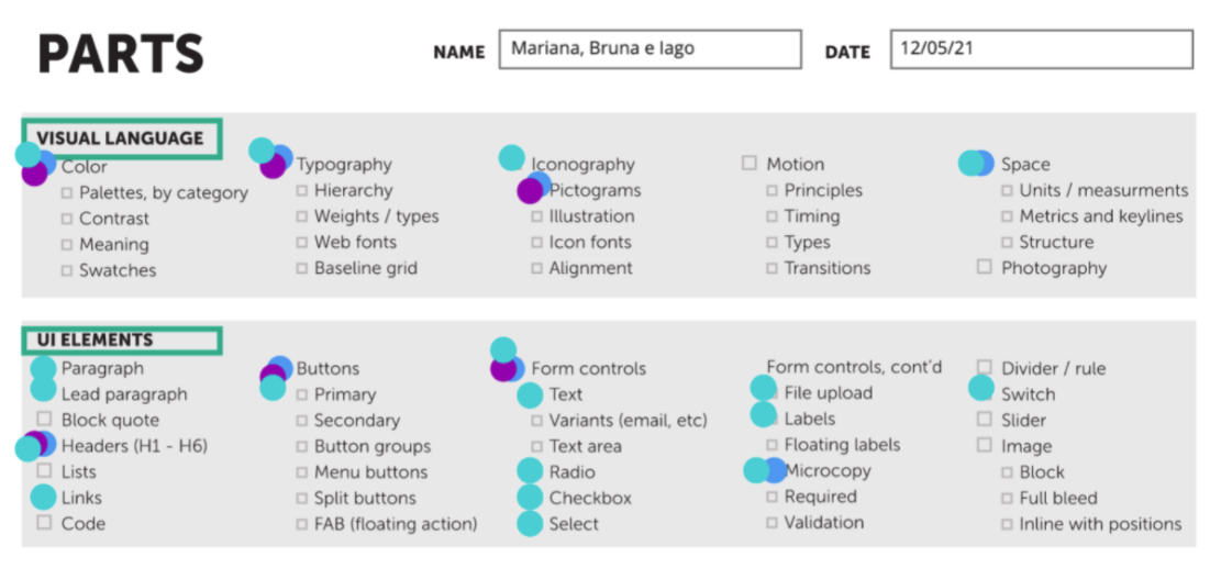
I moderated a workshop to start the project, with one more designer and a frontend developer, following the framework Picking Parts, Products & People, by Nathan Curtis.

The most discussed points were about which components should we do first, how far would we go at first and risks and limitations of the project.


the image shows a list of components and the votes - colored dots - of the team.


Talking with stakeholders

To learn about the team's feelings, I've created a survey and shared it with the team. We concluded that most of the team was familiar with the Design System concept, and believed that creating it would add agility to deliveries.

Stakeholders main pain points were rework, lack of visibility of existing components, inconsistency, and lack of clear guidelines.
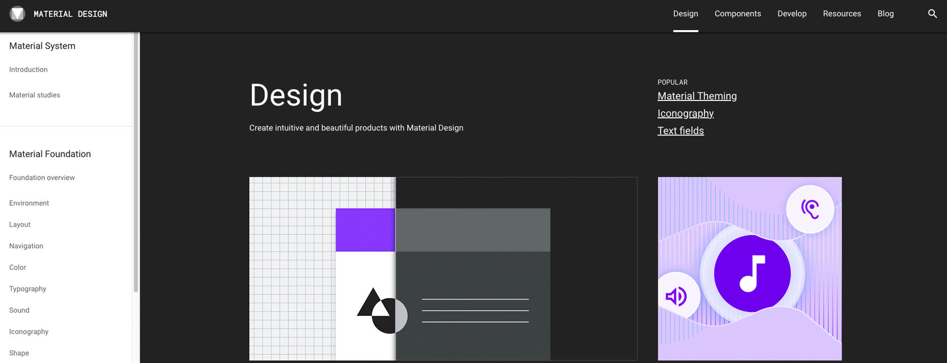

The image show a print of the google form we used, with the introduction text and a purple header.


Benchmark

Looking at the best design system released showed us some practical aspects and filled us with inspiration. We also noticed components that we should include in the initial scope.


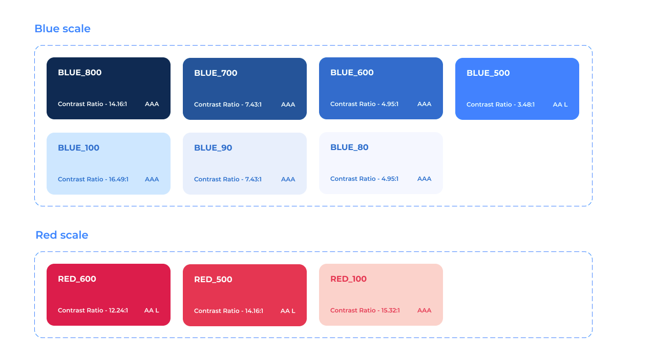
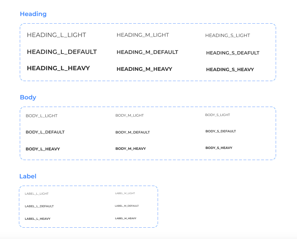
With the research, we got to know new components, learned a lot with the Do's and Dont's and design tokens, in addition to seeing how they separated the UI Kits from the guidelines.


An animation with some printscreens of the researched platforms.


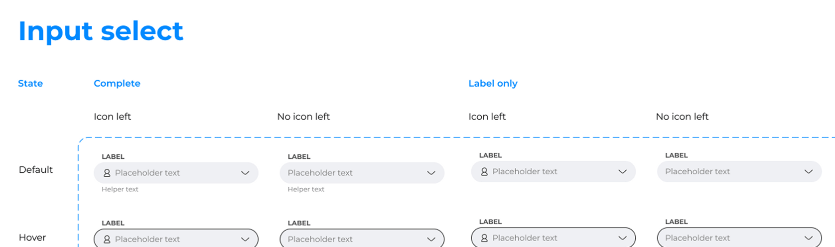
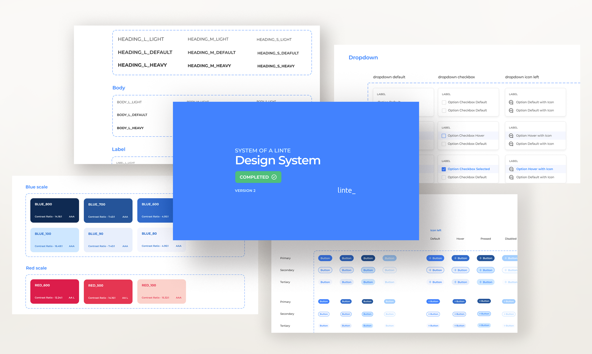
Toolkit and guidelines

We decided to use Figma to house our UI Kit and ZeroHeight to bring all the guidelines and downloadable resources together. Writing the guidelines was one of the work's most challenging and detailed parts.

Figma and Zeroheight logos.


Auditing the interface and style guide

Prior to this design system, the design team had an style guide. Having it as a starting point brought more agility to the team. By auditing the interface and mapping the style guide, we defined which components needed to be redesigned or created.

Delivery

How could we apply atomic design to make the design system functional?


The components were developed according to Atomic Design.
We’ve documented the primary items (atoms) and from them, we’ve created the more complex components (molecules, organisms, etc). So, we began with typography, colors and spacing so then we could make complex structures like navigation components.


Colors

We structured a palette with shades of blue (primary color), red (secondary color), gray, and 6 complementary colors, each with 2 lighter variants. We chose tokens and aliases for each global color code, for example, Blue #500 was also PRIMARY and INFO.

Some of the colours used in the design system, represented with colored rounded boxes.


Typography

Consistency of typography in the product should help people using the system understand the hierarchy of information laid out in the product.

Font size progression was based on classic typographic scaling (The Elements of Typographic Style). Therefore, we consider 16px equals to 1em.

Names of the font styles defined for de design system, such as heading, body, labels and its variants.


Icons

Product icons were designed according to a grid, inspired by Material Design Icon Grid. Also, they should have a base size of 24px and a stroke thickness of 1px.


Icons of building, talk balloon, person, papers and an envelope, animated with the grid that they where created with.


Text inputs

Text inputs were developed with a variety of conditions: they can have right or left icons, be automatic, small, medium, or large, have placeholders, and, preferably be accompanied by text labels. They also have states to show the user feedback, such as hover, active, and error states.


Inputs created for the design system anb its variants, like hover, active and disabled states.

Communication and updates

We created a Slack channel that lets the team know when a design system update happens. This happens automatically, through integration between Figma and Slack.

An image showing the update message for changes in the design system: Hello! We have changes! Then, the description of the change made.

Outcomes

Yes, the design system is a living product.


With constant updates, we noticed several improvements in our routine:

  • Improved consistency score during heuristic evaluations.
  • High-fidelity layouts are made even faster.
  • Changing components specs is no longer repetitive work.
  • New team members had better understanding of the product UI.
  • Now we are almost experts in creating variants in Figma!